Since I have exited my AAPL trade (Article 1 & 2) in early February, I have not touched it. To be fair, I did not expect to see this kind of run and I don’t ever chase stocks if I miss my entry–so I jumped onto something else waiting for the next setup.
We did see a sharp decline yesterday (6/10/17) as AAPL was down -3.88% for the day, and I am wondering if there is further decline to come for this stock.
We have to keep in mind though, that Apple still is in a primary-term uptrend so it’s not a easy job to pin-point exact level of pullback, but through this article I am going to ascertain/attempt to figure out the potential level of support should the price continues to slide.
DAILY CHART
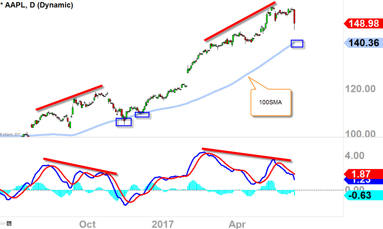
Last Monday (6/5/17) I tweeted out, “..odds are catching up against the buyers” as the bearish divergence started to appear on AAPL. This does not mean AAPL is going to crash, this does not mean primary-term downtrend is starting, but it means profit taking event is in place within the primary-term uptrend which is completely normal as this uptrend has gotten stretched.
So as I have depicted “100SMA (simple moving average)” in the chart below, that’s the level where we found buyers flock back-in in October – November of 2016 (see blue boxes). Interesting to note, that we also did have bearish divergence appeared in October 2016 before the decline in November 2016–which is a similar pattern to what’s happening in the present time.
Should the price continues to fall in the next few weeks, I would look for the rising “100SMA (blue box)” as a possible candidate for a support. I would also advise against being precise with the exact price-point of “100SMA”, but rather, its the vicinity and the rising aspect of the moving average that is important.
Click 2 Enlarge
WEEKLY CHART
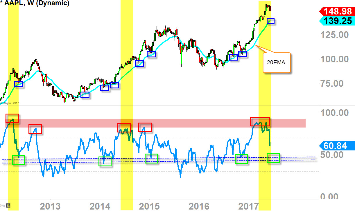
This weekly-chart is little bit more complex, but if you dissect it it’s not too hard to understand.
- Blue boxes represents pullback-support level as it maintains primary-term uptrend (higher lows)
- Red boxes (bottom indicator) represents ‘overbought‘ nature in the stock as it advances to the upside
- Green boxes (bottom indicator) represents the support that aligns with “20EMA”
So the stock will move up for a season and becomes ‘overbought‘ nature as traders & investors start to take profits thus the price pullback, but when the price pulls back it does not come all the way down to the previous swing low, but rather it finds support on that rising “20EMA” –which confirms that trend is up and healthy.
Well, last time AAPL tested “20EMA” was back in Nov/December 2016 (blue boxes), so it has been 6-7 months since the price and the “20EMA” collided. So the next possible/potential level of support to watch might be the rising “20EMA” that coincides with the indicator green box area that could offer support should the indicator and price continues to slide down.
I would also advise against being precise with the exact price-point of “20EMA”, but rather, its the vicinity and the rising aspect of the moving average that is important.


