[divider]
Related Articles
3.26.14 “$XLF $SPY Financials Insinuation” [Part 1]
5.06.14 “Financials & Micro-Caps Insinuation $XLF $IWC” [Part 2]
5.14.14 “Launch Sequence on Treasury Bond (Why This is Bad for the Equities) $TLT $SPY $IEF”
[divider]
5.21.14 Wednesday
[divider]
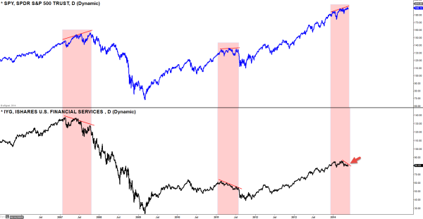
SPDR S&P 500 vs ISHARES U.S. Financial Services
Daily Chart
I use the Financials like it’s one of the market indexes because of the fact that this market needs Financials to do well to be in a healthy state. So the way to figure out if the market is starting to see weakness is to first look at the Financials. Obviously, one should not conclude its major direction only looking the Financials activities but it can be used as supplement and evidences to compile with among other analysis to analyze it’s current market’s health/state.
As you can see on this chart that it was the Financials started to see weakness first long before the S&P 500, and then the divergence started to occur (while S&P 500 started to make, yet, another new high, the Financials started to make lower high) at the top of it’s rally. Today (see red arrow), what we are seeing is subtle discrepancies with the S&P 500, and this could be that piece of information could become very valuable in the near future. If the Financials continue to cultivate lower-highs, that could be a HUGE warning signal for the equity market, especially after a steep uptrend we’ve had last 2-3 years.
Also there is another way to gauge what’s going on under the surface by using weekly MACD indicator to see if the trend is in healthy state. Let’s take a look.
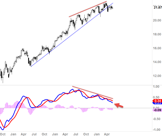
$XLF, Financial Select Sector
Weekly Chart
It’s interesting to note that if we just purely look at the chart itself, it still does look bullish as we are continue to cultivate higher highs on this chart. But take a look at the MACD there. As you can see, it has been diverging with the price action while formulating lower-highs and lower-lows which means momentum is slowly dying; and bulls are getting tired.
Take a look at the next chart. Same scenario.
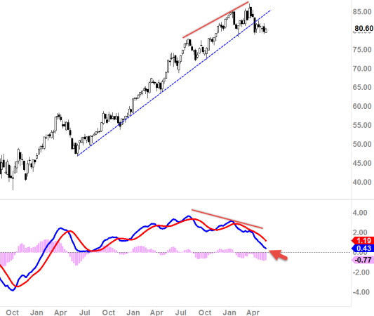
$IYG, ISHARES U.S. Financial Services
Weekly Chart
Momentum is slowly dying; bulls are getting tired..
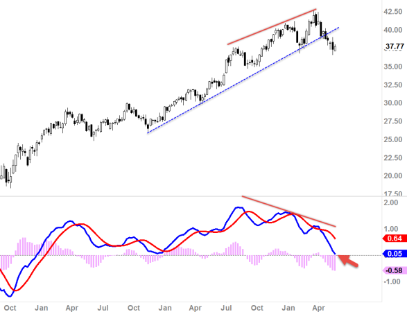
$KRE, SPDR S&P Regional Banking ETF
Weekly Chart
This chart is actually the most bearish looking chart as the MACD is in complete roll-over state, Again, momentum is dying; bulls are getting tired.

![$XLF $IYG $KRE Financial’s Insinuation [Part 3]](https://2tradersclub.com/wp-content/uploads/2014/05/financials.jpg)


