11/27 Tuesday
[divider]
Last November-December of 2011

(Exhibit A – Dow Daily)
vs
Today November-December of 2012

(Exhibit 2 – Dow Daily)
[divider]
[divider]
So as you see the two Dow Jones Index ($DJIA) price charts of November through December of last year and this year, what do you see? What is similar and what is not? What can you point out? I see many things as I have used my greatest red crayon all of the charts. Let’s take a dive at it and dissect one by one.
In the big picture of things, do you see the trend differences? Last November of 2011, we were in a starting of a new bullish trend as the market consolidated Aug-Oct 2011 and then it proceeded with bullish move. How do I know it was a bullish move? Because they were making higher highs and higher lows. Around Thanksgiving holidays (see big red box), when market started to rally to the upside, it was the part of the uptrend move as it was contributing to making the HIGHER LOWS.
So what do you see on 2012’s chart? Can you clearly see that we are in a bearish trend? In this chart, before starting this bearish trend, Dow consolidated (forming a triple top reversal pattern) from Sept-Oct 2012 and then we broke out of that and now in the middle of bearish tend. Dow is making LOWER HIGHS and LOWER LOWS. This is very very important as you figure out where the trend might be going. Yes we did have huge bounce on Thanksgiving weekend just like it did last year’s Thanksgiving weekend. However the difference is that this year the bullish jump was to contribute to making LOWER LOWS (unlike last year’s move was to make HIGHER HIGH). Can you see that on the Exhibit B?
They look identical but if you look at them closely and broadly simultaneously you can soon find out that they are completely opposite and reflects completely opposite sentiments.
So let’s go back to the first chart. As the market started rallying on Nov-December (of 2011) while making higher highs and higher lows, it continued to rally through whole December and continued to January. So now many people are saying that possibly same thing could occur. Also some traders have mentioned to me that last 8 out of 9 winters, market rallied. Maybe so however this year’s chart is very significantly different. Take a closer look at the Exhibit 2 once again and compare with the first chart (Exhibit 1). Can’t you clearly see now that we are making LOWER HIGHS and LOWER LOWS? That is how we define that we are in the middle of downtrend. So what do you think it’s going to look like in December to January this year? I propose you completely opposite from last year.
Currently we are in the middle of downtrend unlike last year’s Thanksgiving weekend. Again for the full confirmation, it will need to take out recent lows to confirm that this downtrend is going to continue. But from looking at the whole picture, you can definitely see the difference and looking at last two day’s price action, market is yet again starting to roll over.
[divider]
11/30 Friday (2:09pm CT)
[divider]
Important Candle Formations

Market likes to reverse (or tell us the bottom or top) with these candle formations. I would watch it very closely next week
[divider]
12/3 Monday
[divider]

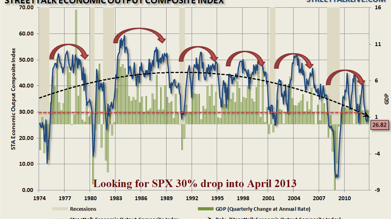
I stole this very interesting chart from “TradeWithMojo” on ST and I find it very interesting and kind of confirms many things that I’ve been analyzing on the overall market lately.
[divider]